Print is dying, and we all know digital is our future. Yet, year after year, at newspaper after newspaper, we keep putting print people in charge. We see the same phenomenon in broadcast as well. Yes,...
Gregor Aisch
CTO DatawrapperHow can we have conversations with data? Is working with data like a conversation? How is data being used as a “source” in journalism, alongside interviews and other content? How are journalists u...
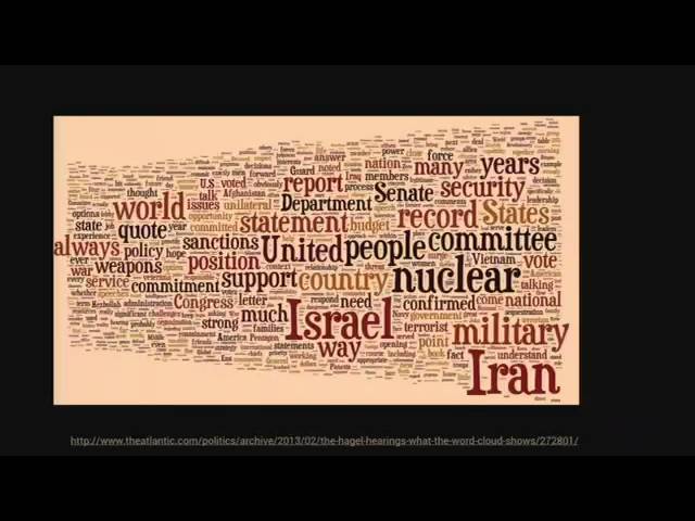
On wordclouds and 3D charts -- and why sometimes it's ok to break rules in data visualization. There are lots of lists of do's and don'ts in news graphics, but while being helpful in theory, many o...
A brief introduction to train all journalists on effective use of line charts, bar charts, pies and combinations. The main goal is to teach what makes a correct, basic chart and why. Level: beginner...
For the last few years the rise of data journalism has generated some hope that newsrooms could make use of new technologies for better reporting. But what about enabling newsrooms to create new servi...
If you are a journalist who is always working on tight deadlines with little resources, this session is right for you. Award-winning data visualisation expert Gregor Aisch will give you an overview ...
Data visualisations have qualities that make them very powerful communication tools. Images and visualisations are often more readily accepted as evidence than texts. But how can we combine the po...
